The PANC-DB portal, developed and maintained by the Data integration and distribution core of HPAP, is the source for all experimental data and metadata from both the T1D and T2D programs of HPAP consortium. The PANC-DB hosts raw data generated by participating cores using a wide-range of deep phenotyping assays. Our data repository was recently upgraded to improve data navigation by implementing new visualization and analysis tools, all described in subsequent sections below.
The Getting started page is meant to serve as a pictorial guide to aid new users with navigating PANC-DB, and become familiar with various features for data access, download and analysis. Figure 1 below shows PANC-DB's homepage with the four primary data access options and the footnote section with more links to resources.
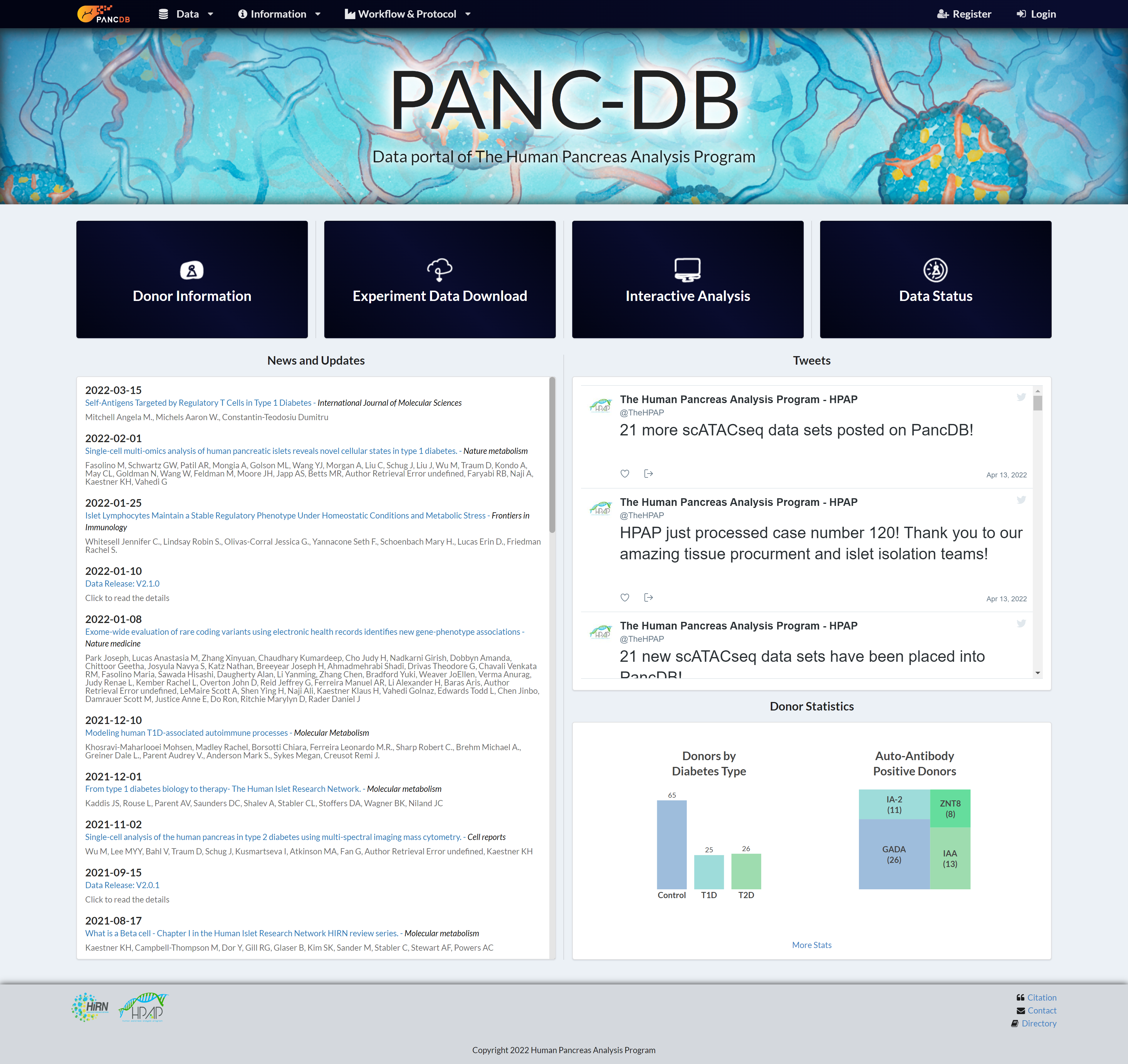
Figure 1: PANC-DB Landing page with four primary data access menu, navigation bar, footnote and news status
The four main icons in figure 1 takes you to different data access and download portals where you can do the following-
Donor Information: hpap.pmacs.upenn.edu/explore/donor?by_donor
This option demonstrated in section C, takes users to a poral with snapshot of donor clinical data such as demographic info, medical history, auto-antibody result, HLA data and more. Users can also access the image and clinical data viewers to aid with decision making and cohort preparation.Experimental Data Download: hpap.pmacs.upenn.edu/explore/download?matrix
This new assay-centric Data Download Matrix capability was developed to improve data navigation and download. See section D for details.Interactive Analysis: hpap.pmacs.upenn.edu/analysis
The Faryabi laboratory implemented this new feature that provides the first interactive data analysis portal for pancreatic single-cell RNA-seq data. The details of the new Interactive Analysis functionality are presented in Section E.Data Status: hpap.pmacs.upenn.edu/explore/download?dataStatus
PANC-DB has offered the improved Data Status matrix to communicate the state of data from various assays for each donor. The goal is to indicate whether particular experiment data for a given donor is available, pending, revoked, or never coming. See section D.2 for details.
In sections B, C and D, we are utilizing a use case scenario to walk you through the database and show you how you can use the repository to your own benefit. We will be using Islet Perifusion assay as our example, which is an islet functional assay performed at two participating institutes under HPAP.
In this section you can find the SOPs for all assays and anaysis hosted on PANC-DB and download them as a PDF. Each SOP has a workflow tab showing how data is collected, processed and generated. Figures 2 to 4 below show how to access the workfllow and protocol menu in general and view the SOP for Islet Perifusion assay on PANC-DB.
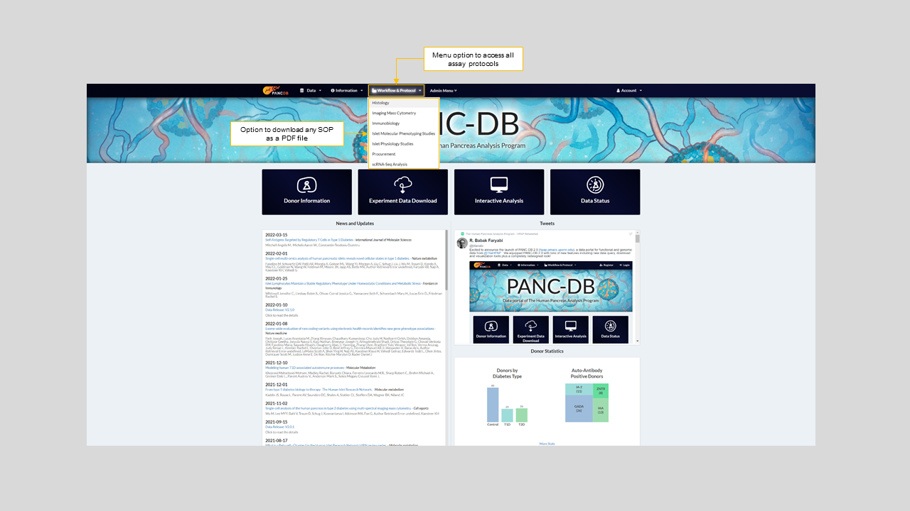
Figure 2: Workflow & Protocols drop down menu on the navigation bar

Figure 3: Islet physiology workflow and selecting Islet perifusion protocol from the Islet physiology drop down menu
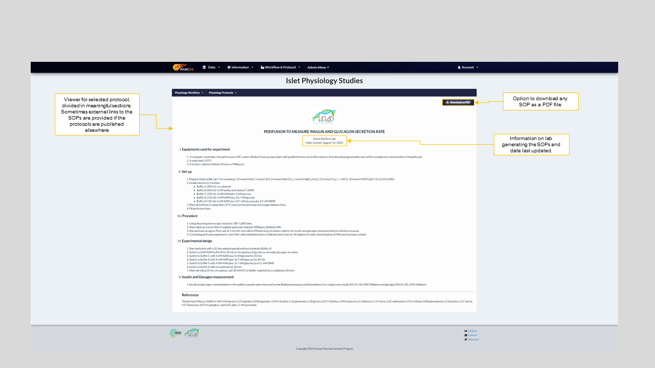
Figure 4: SOP for Islet perifusion performed at University of Pennsylvania
- Donor Information Page
Let’s start with the Donor Information page which is a summary view of our donor datasets. It contains donor cards summarizing a donor’s key clinical and demographic information. The donor cards also provides a snapshot of endocrine cell percentages for alpha, beta, acinar, PP and epsilon cells as obtained from CyTOF analysis. Figure-5 below explains the donor card display in depth, with details on how to find more information on a particular donor and navigate to the donor-specific tabs.
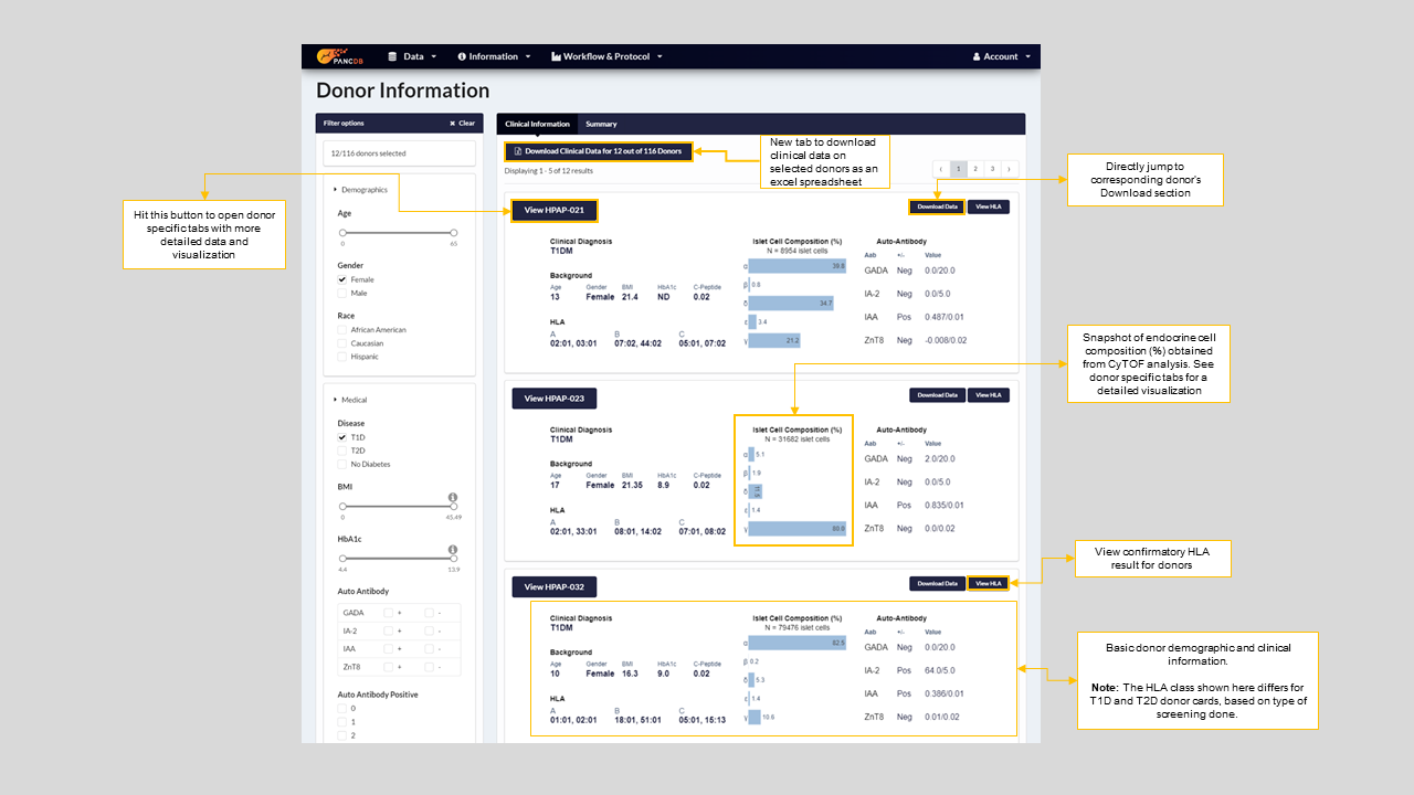
Figure 5: New Donor information page showing donor-cards, donor filters and ways to navigate to other tabs
One can use the donor filters on the left side of the page to create a cohort using key donor phenotypes i.e Democraphics such as Age, Gender, and Race and Medical characteristics such as disease diagnosis (T1D, T2D or No diabetes), HbA1c (%) values and more. Figure-6 describes how to use every option on the filter to browse your data or sample of interest.
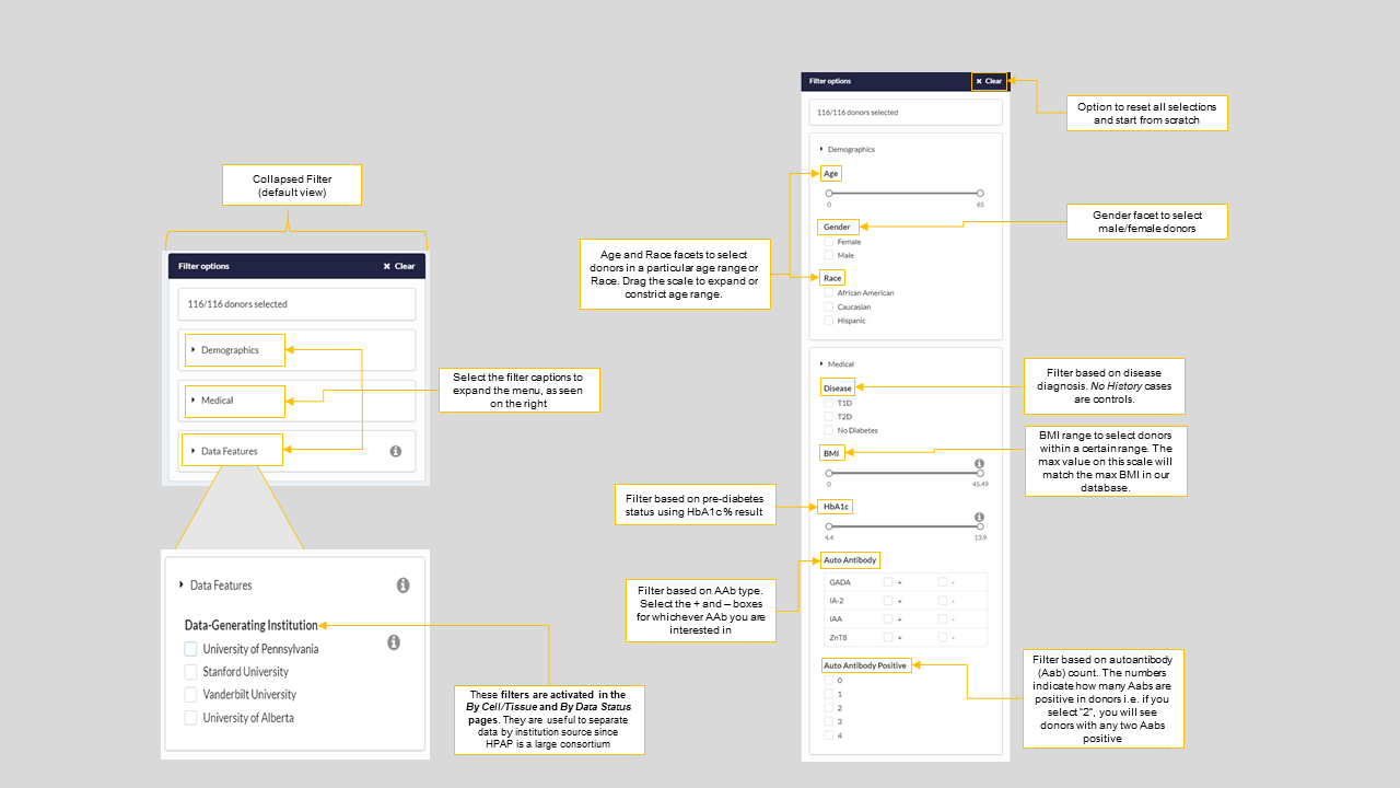
Figure 6: Donor filter options for all data download pages
Once you have your subset of interest i.e. donors with the selected phenotypes, you can navigate to the donor specific tabs for further exploration of specific data. See figure 7 for details on what you will see in this section of the web portal and how to download specific files from that window.
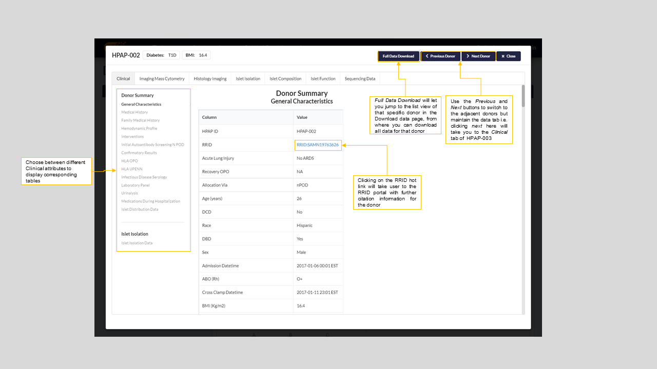
Figure 7: Donor specific window for HPAP-002
The donor specific window for all donors have the following tabs-
Clinical- Detailed medical and clinical history of the donor with the ability to download them as a .docx and .xlsx file. See figure-7 above for details
Islet isolation- information related to islet isolation and quality for a particular donor. It also contains images of the donor pancreas pre and post fat trimming and islets. Figure 8 below shows the Islet isolation tab for HPAP-001
Islet function- Viewer for the Islet perifusion and Oxygen consumption plots for each donor. Figures 9 and 10 show the viewer on PANC-DB and the link-out option to IIDP portal respectively.
Islet composition- Visualization to show endocrine cell counts post CyTOF as well as the tSNE plot for the donor. Figure 11 shows a screenshot of CyTOF pie chart for HPAP-001.
Imaging mass cytometry- Image viewer showing selected IMC slides for a donor. This is a collection of only a subset of the best captured images. To view the remainder of the images, you can either navigate to Pancreatlas’s advanced viewer linked to this tab or download the raw images and import them to your own image viewing application. Figure 11 has a screenshot of the IMC viewer on PANC-DB with its standard anatomy and immune panel filters.
Histology imaging- Similar to the IMC viewer, this tab is an application to view a subset of the best Histology slides for the donor. Remainder of the images can be viewed on Pancreatlas or the raw svs files can be downloaded. Figure 11 shows a screenshot of the Histology viewer with its anatomy and magnification filters.
Sequencing data- this tab is a direct way to access the sequencing files hosted on PANC-DB for a particular donor. It also provides the option to visit CMDGA portal for the same data. CMDGA provides advanced visualization and navigation features.
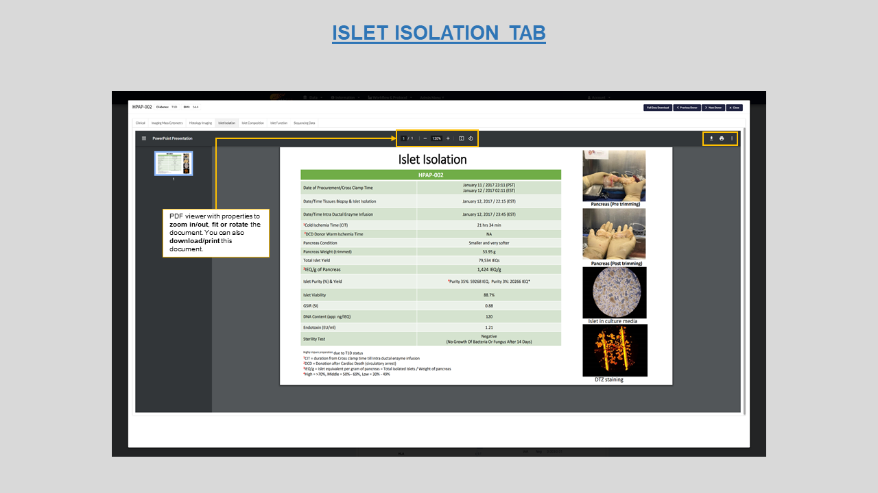
Figure 8:Islet isolation viewer for donor HPAP-001
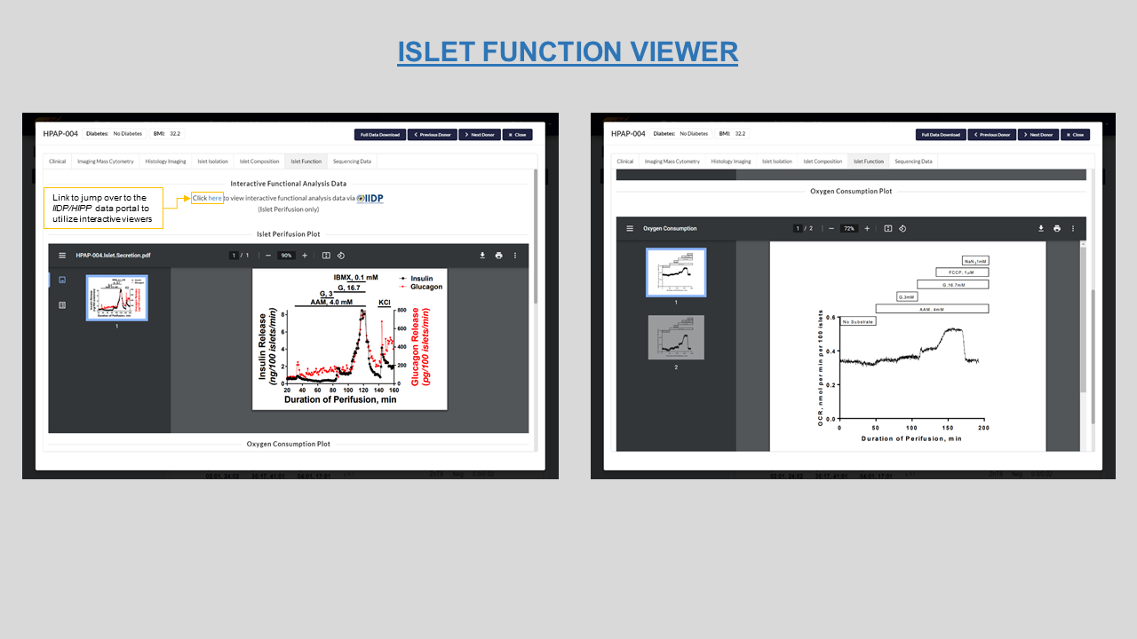
Figure 9: Islet Perifusion ad Oxygen consumption plots along with link to visit IIDP database for HPAP-004
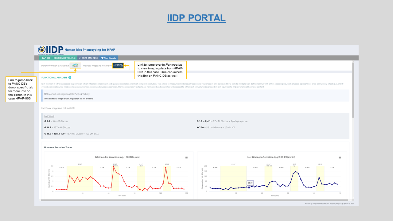
Figure 10: Interactive Islet perifusion plot on IIDP portal with dono-to-donor link to Pancreatlas and back to PANC-DB
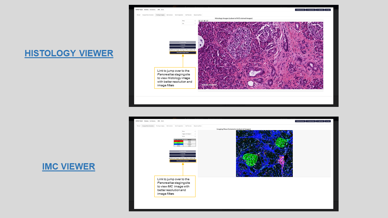
Figure 11: Histology and IMC image viewers with fiters for HPAP-003 on PANC-DB
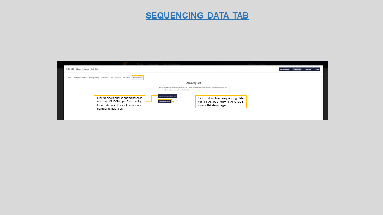
Figure 12: Sequencing data tab for HPAP-003
- Experimental Data Download page
Now let’s move on to our data download pages with user-friendly matrix view of our data. Users can retrieve their data based on various intuitive and relevant filters and download them in bulk or for single donors. An important upgrade to this feature is the ability to also use the Donor filters to select a subset of donor phenotypes such as disease type, demographics etc to create a subset.
- Download By Cell type/Tissue-
- Download By Data status & Donors-
- Available- data that is currently available on PANC-DB
- Pending- this is the default data status i.e. data that is expected to be available on PANC-DB
- Never- data that is never expected and hence will never be available on PANC-DB
- Revoked- data that was posted on PANC-DB but subsequently removed since the generating core deemed it unusable
- Download By Donor List-
This page organizes our data into meaningful experimental units and categorizes data by cell type and tissue on which various assays were performed to genertate the raw data. Hence, Available data are organized along two dimensions i.e., Assay type and Tissue/Cell type, giving a concise overview of available data.
The experimental unit differs for every assay, for instance for IMC, data is collected for three pancreatic region i.e. head, body and tail of pancreas, each region making 1 unit so a total of 3 units per donor. Figure 13 shows available experiments for Islet perifusion assay for all donors on PANC-DB.
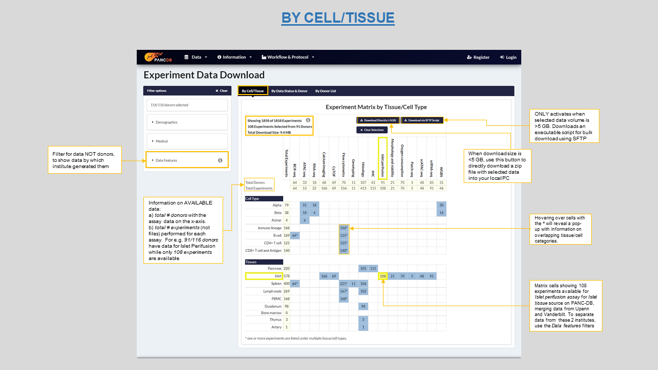
Figure 13: Download by Cell/Tissue type matrix showing 108 experiments for Islet Perifusion and ways to download the data in bulk
This page also provides a matrix view of our data categorized by different availability status per donor sample. Each cell in the matrix shows the number of experiments for a given Status-Assay combination per donor. This provides a quick and intuitive overview of all data. The four data availabilty criterias on this page are-
The figure below shows status for Islet Perifusion data for type-1 diabetes (T1D) donors in the new Data Status Matrix. The four different criteias are color coded. When hovering over a cell, the corresponding row and column headers are highlighted for better navigation. Both direct download as a zip file (size <=5 GB) as well as SFTP (size >5 GB) are available.
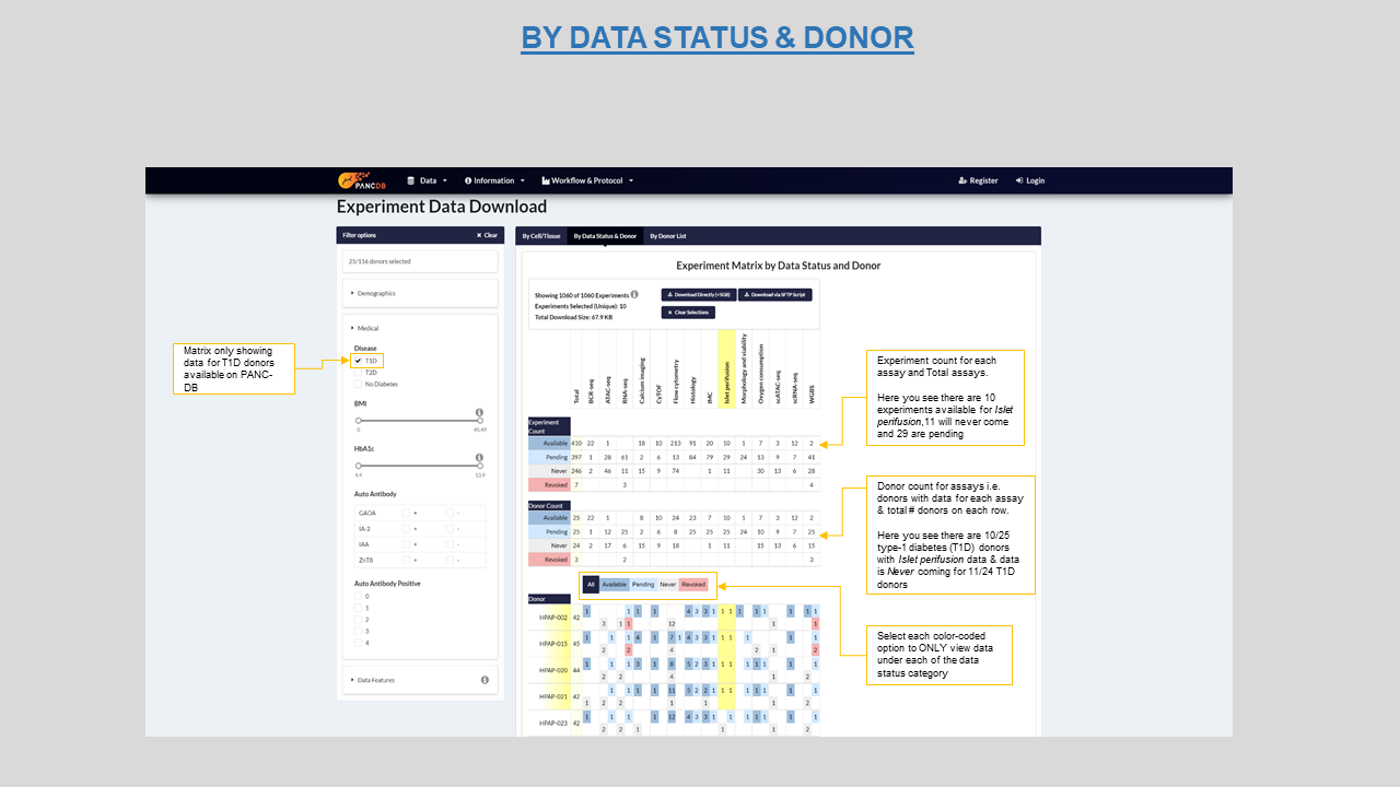
Figure 14: Data status matrix highlighting "available" Islet perifusion data for T1D donors in yellow
This page lists all donor datasets live on PANC-DB by their HPAP IDs and clicking on each donor will reveal the underlying sub-folder organization that contain downloadable data. Figure 15 lists T1D, T2D and No Diabetes donors and their sub-folders. In order to download any data, navigate to the desired folder or sub-folder and select appropriate checkboxes. You can either download single files or the entire collection of assay folders for the selected donor. You can select the View data structure button on top right, to view a schema of folder organization
The list of donors on this page does not represent the number of donors accepted by the HPAP program. It usually takes upto 14 days to make a recently accepted donor live on PANC-DB. The list however represents the donors currently live (visible) on the database with at least one assay data available for download. The basic requirement for a donor to be live on PANC-DB is, to have the clinical data ready to display and download. This activates the donor cards on the Donor information page.
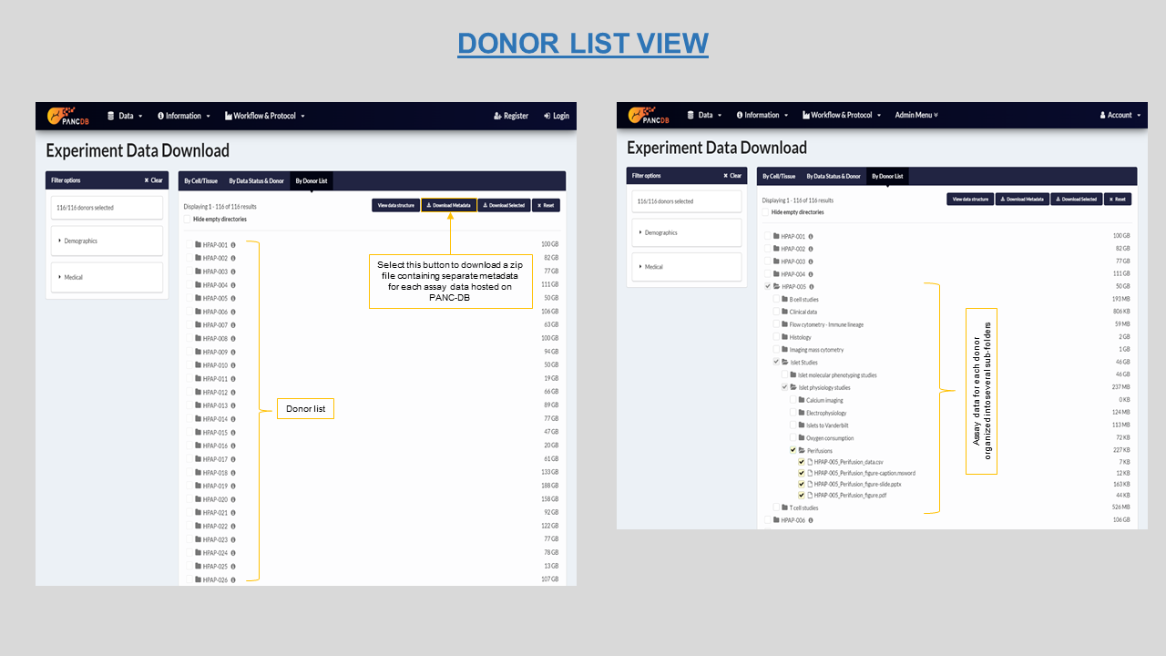
Figure 15: Donor list view with the metadata download option
When trying to download data, you might be prompted to register yourself or login as shown in figure 16. It’s a simple three step process explained here. Refer to figure 16 for ways to avoid downloading empty folders from the list view. Users can download assay metadata on this page as well. When you download the metadata, you will acquire a zip file with a stack of spreadsheets for each assay, as shown in figure 17. You will also download a “README” file with information on each assay, as well as the file “PancDB_Donors” with donor demographic information, RRIDs, and relevant links.
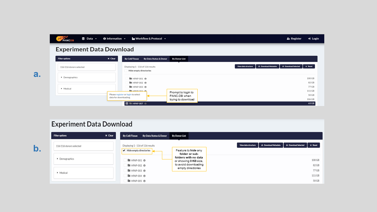
Figure 16: a) Users must register/login to download any data b) How to hide empty directories before download
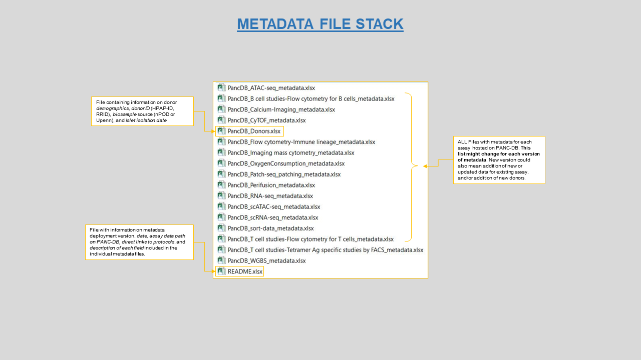
Figure 17: Collection of metadata spreadseet all downloaded as a zip file from PANC-DB
The News and Publications section is divided into two parts-
Data release page- this section contains updates related to HPAP data and PANC-DB features. As you can see in figure 18 below, any changes to data hosted on PANC-DB will be posted here. If any data is revoked for any reason and replaced with newer versions, links to those legacy files will also be available in the data release page.
Publications page-In this section all HPAP related publications are listed in a chronological order. Direct links to the online copy of the articles is provided for each listed study in the Publications tab so users can download the full text articles.
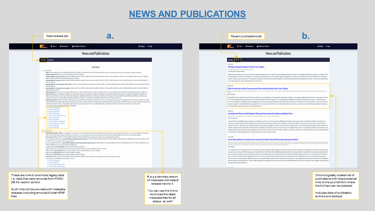
Figure 18: News and Publications page on PANC-DB showing a) latest version of metadata and links to legacy data b) latest publications using HPAP data
We have now expanded the role of PANC-DB as a data analysis platform by introducing the first interactive data analysis portal for pancreatic single-cell RNA-seq data. To provide this one-of-a-kind capability, the team has collected, harmonized, and processed transcriptomic data of more than 270,000 cells from more than 70 donors. The result of this massive single-cell transcriptomic analysis is provided as a Seurat object to the PANC-DB users. Faryabi lab has developed a code that allows conversion of the Seurat object to AnnData binary object that is required for inputting data to PANC-DB's CellXGene (figure 19).
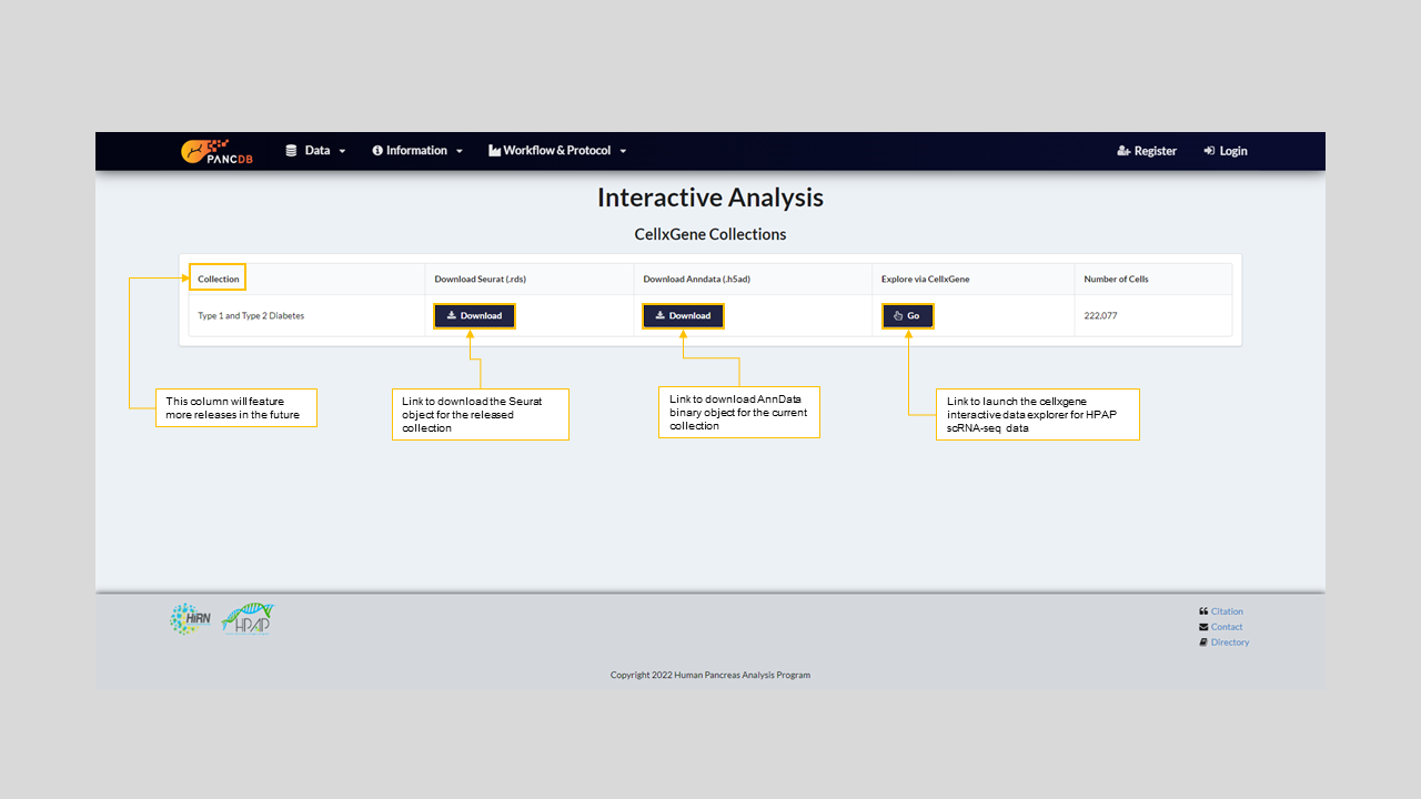
Figure 19: PANC-DB's Interactive Anlaysis Page
PANC-DB's CellxGene offers a number of unique features and can be used for a variety of interactive data exploration. We have demonstrated some of the functionalities with a use case scenario:
- Viewing multiple embeddings of the same dataset, like UMAP, T-SNE, and PCA. For instance, a user can color the UMAP presentation of cells by their predicted cell types as shown in figure 20 and figure 21.
- Sub-setting cells by cell annotations, which can be enumerated or continuous values (Figure 20).
- Users can also select any subset of cells by drawing a closed curve encompassing the cells (figure 21). This option allows users to mark different subsets of cells for downstream analysis.
- User can visualize expression level of a particular gene across various populations by coloring the UMAP. For instance, the examination of INS expression shows elevated level of this gene in Beta cells, as expected (figure 22).
- One can compare the expression of two genes across cells from different donors on a bivariate plot. For instance, comparing expression of INS and GCG shows that their expression levels are not correlated independent of the disease condition (figure 23). One can compare any number of genes by adding them t the gene list on the right side panel as shown in figure 23.
- CellxGene also offers various ways to interactively compare gene expression between two groups of cells. For instance, differential gene expression analysis identifies GCG as the most upregulated gene in Alpha compared to Beta cells (figure 24). Currently, the differential expression functionality has an upper limit of 50,000 cells (between population 1 and population 2). Hence, users need to be strategic about targetting types of differential expression tests to run on large datasets.
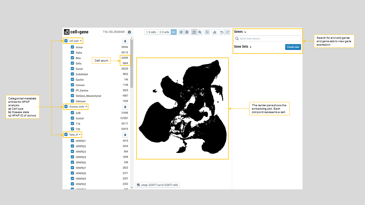
Figure 20: Landing page for PANC-DB's CellxGene analysis showing the primary categorical variables factored in the dataset i.e Cell type (cell_type), Disease type (disease_state), and Donor HPAP ID (hpap_id).
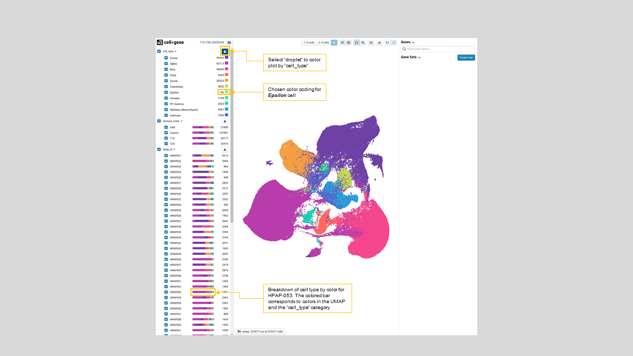
Figure 21: Cell annotations colored on UMAP. On the left menu bar, the color map by “cell_type” is chosen, which highlights the cells by its classification
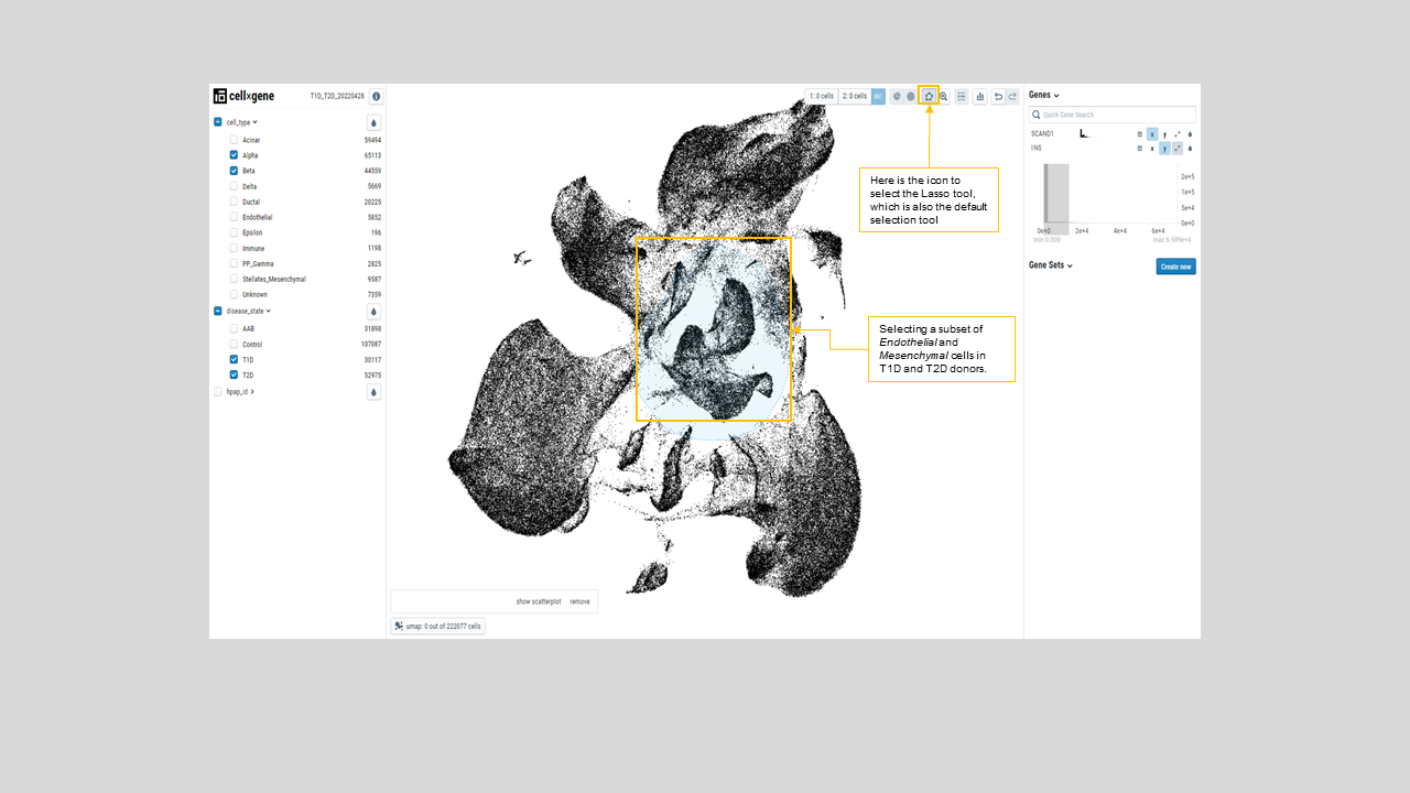
Figure 22: Demonstration of the lasso tool which was used to select a circle of cells on the UMAP
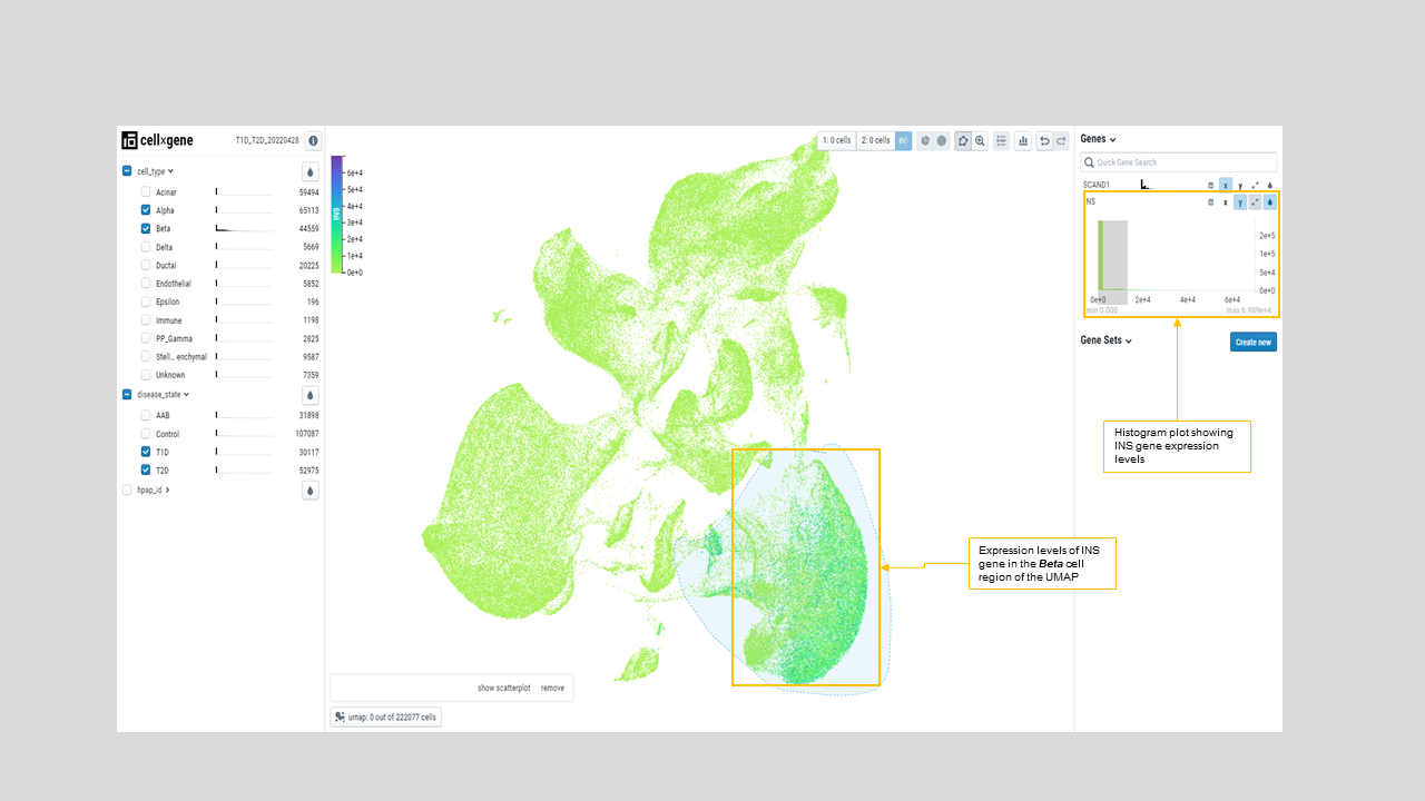
Figure 22: UMAP is colored by INS expression, which shows the elevated expression of INS (darker green to blue) in the annotated Beta cells located on the UMAP lower right part. Histograms on the left side menu show the INS gene count distribution on various annotated cell types
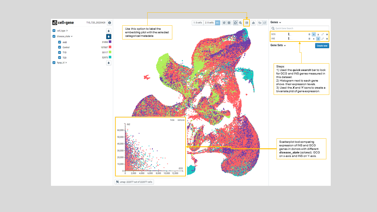
Figure 23: Scatterplot comparing INS and GCG expressions in cells from T1D, T2D, control and AAB donors, marked by “disease_state” color from the left side menu. As expected, INS and GCG expressions are not correlated.
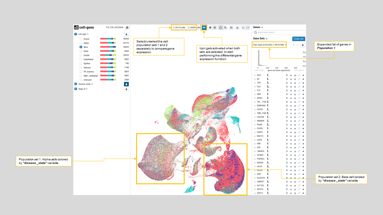
Figure 24: Results of differential expression of “Alpha” vs “Beta” cell types. The resulting gene list, shown on the right-hand side, identifies GCG as the most upregulated gene in the Alpha compared to Beta cells.